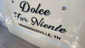
Cursive boat lettering is a popular way to give a boat a refined and personal look. Many boaters choose cursive styles because they add character without overpowering the vessel. When designed correctly, flowing script lettering remains readable while enhancing the boat’s overall appearance.
Boat lettering also serves a practical role beyond style. It communicates boat names, registration numbers, and identity on the water. This article explains how cursive lettering works, how to design it properly, and what to remember before placing an order.
What Is Cursive Boat Lettering?
Cursive boat lettering uses script-style fonts with connected letters and smooth curves. These fonts often resemble handwritten text, which creates a softer and more elegant visual statement than block lettering. Instead of sharp edges, cursive lettering emphasizes flow and continuity.
Boat lettering in cursive form is commonly used for boat names and decorative text. In some cases, it may appear alongside a registration number when regulations allow. The key is to balance elegance with clarity so the lettering remains readable on the hull.
Why Boaters Choose Cursive Boat Lettering
Many boaters choose cursive boat lettering because it feels personal and expressive. The script style adds personality and a sense of fun without appearing loud or overpowering. It complements both modern and classic boats when applied thoughtfully.
Cursive lettering also helps a custom boat stand out at a dock or marina. When designed well, it enhances the boat’s image without creating visual clutter. The lettering becomes a natural part of the boat’s overall design rather than an afterthought.
Popular Cursive Styles Used on Boats
Cursive lettering comes in many styles, each creating a different mood. Some fonts feel formal and traditional, while others appear relaxed and playful. The chosen style sets the tone for how the boat is perceived.
Script fonts also vary in thickness, spacing, and decorative details. Choosing the wrong font can reduce readability on water, especially at a distance. The right font improves both style and function.
Choosing a Style That Stays Readable
- Readable script avoids excessive loops and tight curves.
- Clear spacing between letters improves visibility at a distance.
- Avoid fonts that rely heavily on thin lines or extreme flourishes.
Common Cursive Font Styles
| Cursive Style | Visual Feel | Best Use |
| Classic Script | Elegant and smooth | Transom boat names |
| Handwritten Script | Casual and personal | Small recreational boats |
| Bold Script | Strong and visible | Dark hulls or textured surfaces |
| Decorative Script | Artistic and detailed | Large lettering only |
Best Placement for Cursive Boat Lettering
Placement affects both readability and longevity of cursive boat lettering. Most lettering appears on the transom or along the hull sides, where there is enough space for flowing text. These areas support clear visibility and balanced design.
Port and starboard placement allows boat names to be seen from multiple angles. The hull’s curve should guide lettering scale and alignment for a clean look. Always place lettering where it remains visible above the waterline.
Placement Mistakes to Avoid
- Avoid placing cursive lettering too close to the edges.
- Do not stretch the script across uneven hull surfaces.
- Never crowd letters near vents or hardware.
Size, Spacing, and Readability Guidelines
Letter height plays a key role in how well cursive lettering reads from a distance. Script styles often need more width than block lettering, so each letter should have enough space to remain clear. Proper spacing helps the text feel balanced and easy to read.
Spacing matters more with cursive fonts than with straight lettering. Poor spacing causes letters to blend together, especially when viewed on water. Always scale cursive lettering to match the size and shape of the hull.
Readability Checklist
Check These Before You Apply Lettering
- Letter height matches viewing distance
- Script spacing remains clear
- Color contrasts with the hull
- Font avoids thin strokes
- Text reads clearly in motion
Color Choices for Cursive Boat Lettering
Color choice affects readability, longevity, and overall style of boat lettering. High-contrast colors improve visibility in bright water conditions, especially under direct sunlight. Dark vinyl typically works best on light-colored hulls.
Metallic finishes add shine but may create shadows that reduce clarity. Matte finishes help reduce glare and improve readability. Always choose colors that match the boat’s overall design and finish.
How Sunlight and Water Affect Color
- Sunlight creates reflections that hide low-contrast text.
- Water movement adds glare and visual noise.
- Strong contrast keeps lettering readable in changing light.
Materials Used for Cursive Boat Lettering
Marine-grade vinyl is the most common material used for boat lettering. This type of vinyl resists water, UV exposure, and peeling over time. Standard indoor vinyl does not hold up in marine environments.
Vinyl lettering sticks securely when applied correctly and can handle years of sun and salt exposure. High-quality vinyl also helps prevent edges and outlines from lifting, keeping the lettering clean and intact.
Legal and Registration Considerations
Registration numbers must meet specific size and placement rules. These rules often require a set height and proper spacing for readability. Cursive lettering is typically allowed only for decorative text, such as boat names.
The registration number should always remain clear and easy to read. Never replace required numbers with decorative script. Always check local boating regulations before applying any lettering to your boat.
Custom vs Pre-Designed Cursive Boat Lettering
Custom boat lettering allows full control over design, scale, and layout. It helps match the lettering to the hull shape and supports unique boat names that feel intentional and balanced. Custom designs work well when visual precision matters.
Pre-designed fonts offer quick and easy options for standard layouts and budgets. They simplify the selection process while still delivering clean results. Both custom and pre-designed lettering can create a strong visual impact when chosen carefully.
Custom vs Pre-Designed Lettering
| Option | Advantages | Limitations |
| Custom Cursive Lettering | Unique fit and balance | Requires design review |
| Pre-Designed Fonts | Faster to order | Limited flexibility |
Installation Basics for Cursive Boat Lettering
Proper installation helps ensure long-lasting vinyl lettering. Clean the hull surface before applying vinyl and remove all wax, dirt, and moisture. A clean surface allows the vinyl to bond securely.
Use a squeegee to press the vinyl evenly onto the hull. Apply pressure from the center outward to release air. This method helps prevent bubbles and wrinkles during installation.
How to Maintain Cursive Boat Lettering
- Regular cleaning helps vinyl last longer.
- Use mild soap and fresh water.
- Avoid abrasive pads or harsh chemicals.
- Check edges for early peel signs.
- Fix small issues before they spread.
- Proper care extends vinyl life by years.
Common Mistakes to Avoid
Choosing style over readability often causes design problems. Thin script fonts fade faster and tear more easily, while poor color contrast can make lettering disappear in direct sunlight. Readability should always come first.
An incorrect scale can ruin visual balance on a boat. Crowded text looks messy and rushed, especially on curved surfaces. Always review the design carefully before final placement.
Ordering and Design Review Process
Ordering cursive boat lettering should feel simple and straightforward. Most systems let you enter text, choose a font, and preview the design on a boat image. This preview helps confirm layout and style before moving forward.
Once the design looks right, add the lettering to the cart. Review spacing, letter height, and color carefully. Submit the order only after checking all details.
Understanding Price and Value
Price depends on factors such as size, vinyl type, and design complexity. Custom script designs typically cost more than simple text, but quality materials help justify the price over time.
Cheap vinyl may peel within months, especially in marine conditions. Marine-grade vinyl lasts for years with proper care. Always compare the overall value rather than focusing only on price.
How Cursive Lettering Enhances Boat Identity
Boat names tell a story, and cursive lettering turns that name into a visual statement. It adds emotion and personality to the vessel while enhancing its overall appearance. The style helps the name feel intentional rather than decorative.
The lettering becomes part of the boat’s identity and reflects pride and care from the owner. A well-designed name stands out without overpowering the boat. Thoughtful lettering leaves a lasting impression.
Timeline From Order to Application
Most lettering orders process quickly once submitted. Design review usually takes one business day, and production begins after approval. This timeline helps keep the process efficient.
Shipping time varies by location, but the application often takes less than an hour. Results appear immediately after installation. The change is visible right away.
Serving Businesses Across the Florida Panhandle
We offer custom boat lettering and graphic services throughout Okaloosa County, Florida
- Crestview
- Destin
- Fort Walton Beach
- Holt
- Laurel Hill
- Mary Esther
- Niceville
- Ocean City
- Okaloosa Island
- Shalimar
- Valparaiso
- Wright
- Bluewater Bay
- and the surrounding areas
Conclusion
Cursive boat lettering combines style, readability, and durability when designed with care. The right script, spacing, color, and placement help boat names stand out while remaining easy to read on the water. By choosing marine-grade vinyl and following proper design and installation practices, cursive lettering becomes a lasting part of a boat’s identity rather than a temporary detail.
Vintage Sign & Light focuses on commercial signs, channel letters, Watchfire displays, storefront signage, and interior wall graphics. For boat lettering, decals, and marine graphics, visit Vintage Marine Graphics for dedicated boat-related services: https://vintagemarinegraphics.com/
FAQs
Is cursive boat lettering readable on water?
Yes, cursive boat lettering is readable on water if the font is clean, spaced well, and sized correctly. High contrast colors and simple script styles improve visibility from a distance.
What height should cursive lettering be?
Cursive lettering should typically be at least 3 to 4 inches tall for good visibility. Larger boats often use 4 to 6 inches for better readability on the water.
Can cursive lettering replace registration numbers?
No, cursive lettering cannot replace registration numbers. Registration numbers must follow legal size, font, and placement rules set by maritime authorities.
Does vinyl lettering last in saltwater?
Yes, marine-grade vinyl lettering is designed to withstand saltwater exposure. Proper installation and UV-resistant materials help extend its lifespan.